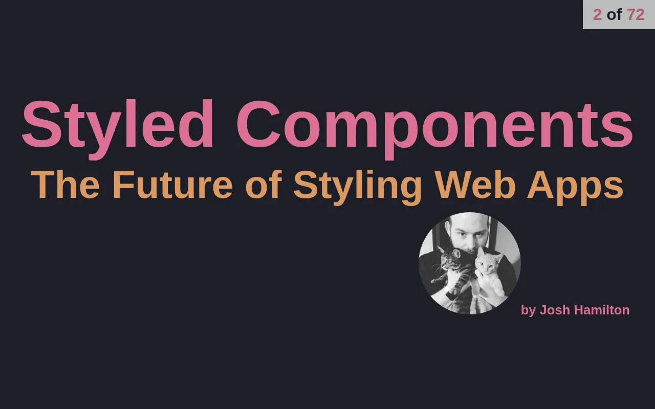
This repository holds the slides for a talk on styled-components, written for Tulsa TechFest 2017. The deck is a small React app with 72 slides, where every slide, heading and live example is a styled component.
The commits run from July 20 to July 28, 2017, and the last one merges a contributor’s spell-check pull request. The first slide points to a copy hosted at styled.nearbycoder.com, which no longer answers, so running the repository locally is the way to see the deck today.
The talk
After the title comes a slide with the logo of Made By Munsters, the speaker’s employer at the time. Then the talk opens with a history of styling on the web: Håkon Wium Lie’s first draft of Cascading HTML Style Sheets in October 1994, CSS 1 in December 1996, CSS 2 in 1998, CSS 2.1 in 2011 and the modules of CSS3. Then come the preprocessors (Sass, Less and Stylus), with SCSS nesting, mixins and extends shown next to the plain CSS you’d write without them, and a slide on their costs: a compilation step, the cascade, harder debugging, and maintenance and overengineering.
The second half is styled-components. After a list of pros and cons, each feature gets a slide with its code and a live result that the deck renders.
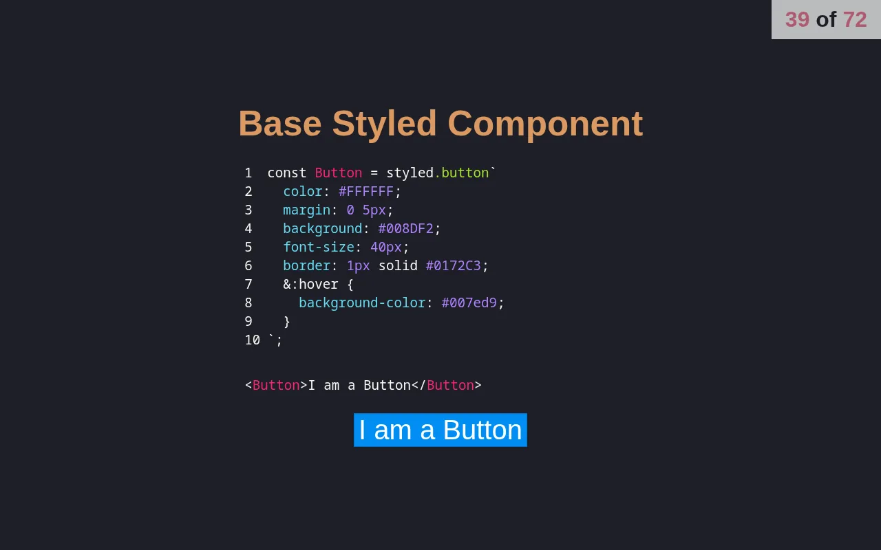
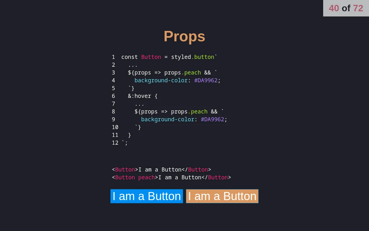
From there the talk explains tagged template literals, which are how styled-components hands a component’s props to the functions inside its CSS, and shows the class names it generates in the DOM. It then works through nested selectors, extending a component, mixins, keyframe animations, styling custom components, swapping the base element with withComponent, media queries, theming, attrs, React Native, the risk of interpolating user input into CSS, refs, and existing CSS classes. It ends with three takeaways: components stay modular and reusable, styles live beside the component instead of in separate Sass, Less or Stylus files, and changing styles is as easy as changing state.
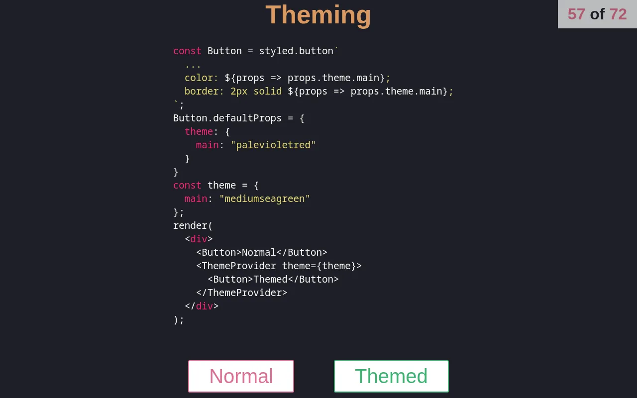
ThemeProvider, and the two buttons it produces.How the deck works
Near the end, a slide announces that “Even this slide deck was built with Styled Components” and shows the deck’s own code. Deck holds the current slide in state and swaps slides with a cross-fade. The left and right arrow keys and Page Up and Page Down move between slides, F toggles fullscreen, and every slide has its own URL (/12 is the thirteenth), so a reload stays put. A counter in the corner shows the position.
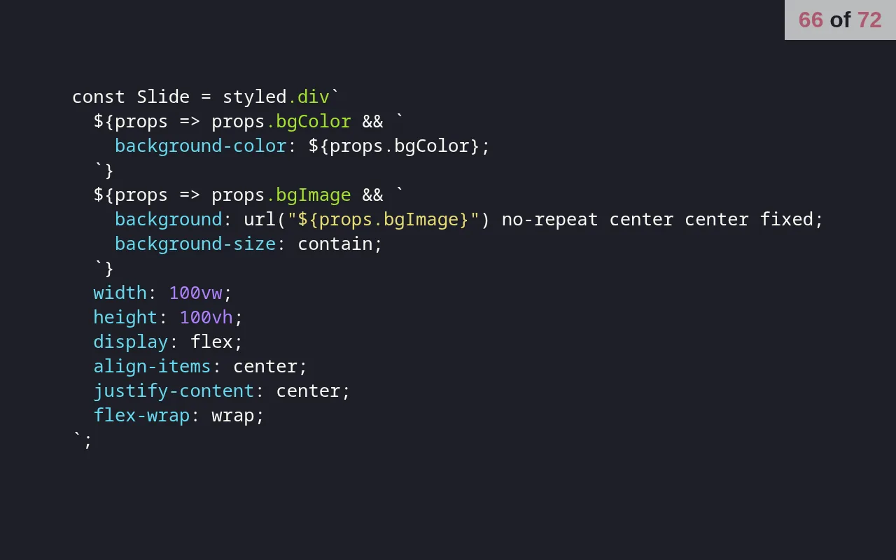
Slide component, shown on one of its slides.Slide and the H1 to H5 headings take props like bgColor, bgImage, color and p, and their font sizes are in vw units, so the text scales with the window. Code samples are highlighted with react-syntax-highlighter.
How it’s built
It’s an ejected Create React App project on React 15.6 and styled-components 2.1, built with webpack 2.6 and Babel. The Babel config adds the function-bind plugin for the :: syntax the deck uses. The same deck code came back for the GraphQL talk at TulsaRB in 2018.
Running it today
It still builds with Node 8. Installing with Yarn 1 and --ignore-scripts skips compiling node-sass, a dependency the deck doesn’t use, and yarn start then serves the deck on port 3000.
The creation date shown here is the GitHub repository’s UTC creation date. The slides on this page were captured by running the deck locally from its source.