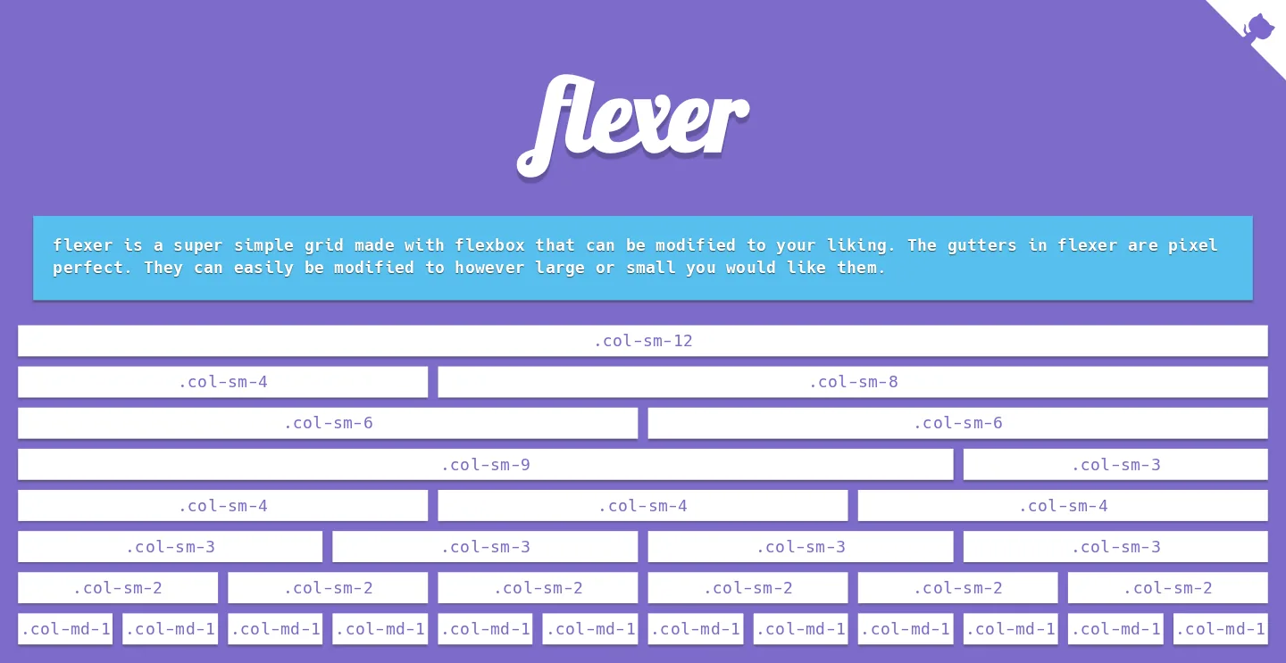
Flexer is a grid layout built on flexbox and written in Sass. A .row wraps its columns, and classes like .col-sm-6 or .col-lg-4 give each column a width in twelfths of the row, minus a fixed gutter. The repository has the Sass partials, the compiled flexer.css and flexer.min.css in dist, and a demo page published on GitHub Pages.
All ten commits were made within a day in late January 2016, and the repository hasn’t changed since. The demo page still loads and works.
The grid
The settings live in _vars.scss: 12 columns, a 10px gutter, rows 98% wide and containers up to 1400px. The sm classes have no media query, so they’re the base size, and the md, lg and xl classes start at 751px, 971px and 1171px. Loops in _flex.scss generate a class for every column count at every size, plus -outer- columns without gutters and -os- offsets that push a column to the right.
The col mixin subtracts the gutter inside calc() and puts half of it on each side as margin, so columns stay exactly 10px apart at any width. The demo calls the gutters “pixel perfect”, and changing $gutter-size resizes them all.

The demo page
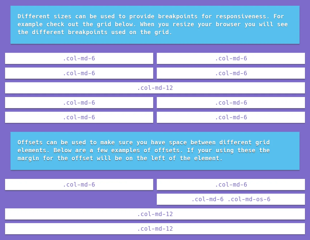
The demo labels every box with the class that applies at the current width. Each box lists its class for every size in data attributes, and a jQuery resize handler swaps in the matching label, so resizing the browser shows the breakpoints change.
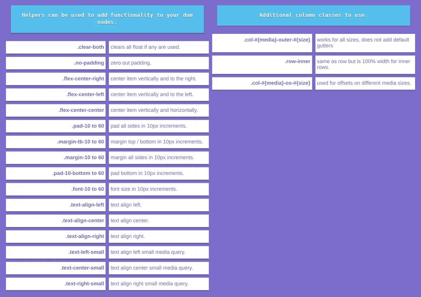
The page also documents its helper classes: clearing floats, centering with flexbox, padding, margins and font sizes in 10px steps from 10 to 60, and text alignment, including variants for small screens.
How it’s built
Gulp 3 runs the build. Its scss task compiles the partials with gulp-scss, a plugin that calls Ruby Sass’s scss command, minify writes flexer.min.css with cssnano, and dist copies the Sass partials into dist/scss. The default task serves the demo with gulp-webserver and reloads it on changes.
Flexer’s partials also appear in Mun-Accordion, a code challenge started the day before, whose demo page describes its CSS as “compiled scss that I built as a custom grid framework.” Several files are identical, Flexer added the outer columns and .row-inner in later commits, and its demo page still has ng-app='AccordionDemo' on the <html> tag.
The creation date shown here is the GitHub repository’s UTC creation date. The screenshots come from the live demo on GitHub Pages, and the code card shows a real source file from the repository.